Was Dragons Blood on your colonial bingo card?
Ask any casual design enthusiast what colors they would choose if they were assigned to paint a replica of a colonial-era room, and they’ll probably suggest a color akin to slate blue or burgundy. Saturated, yet muted. Something historic.
But history is hiding secrets behind years of fading and layers of paint, revealing vivid hues like Prussian blue, verdigris, pink, and emerald. These colors feel more like a throwback to the 1970s, not the 1770s. Yet it turns out, even the Founding Fathers enjoyed a pop of color, particularly when it spoke to their ability to be on trend.
Today the conservation and curatorial experts at Colonial Williamsburg are working to both change the colonial color palette and evolve public perception around 18th-century style du jour.
“People are not expecting bold colors like Dunmore Green or Dragons Blood as a part of our paint collection with Benjamin Moore, but the truth is that the muted tones of the past were based on degraded paint that did not properly represent period colors,” explains Kiri Franco, Williamsburg’s director of brand and licensing. “The vibrancy of 18th-century interior colors is surprising.”
More Than Peeling Paint
The reality of colonial colors appeared in the 1990s, when color research analysis evolved past peeling layers of paint. “We now have the ability to look at the pigments that were available at the time and analyze how that would have changed over the years,” says Kirsten Moffitt, Colonial Williamsburg Foundation’s conservator and materials analyst.
Moffitt’s meticulous work within a lab analyzing the scientific makeup of each layer of paint and how it would have reacted to years of degradation then informs the work of Amanda Keller, CW’s historic interiors and associate curator of household accessories.
“Color was treasured back then,” says Keller. “It’s so ubiquitous today that we take it for granted. We can paint our rooms any color we want. In the 18th century, however, it was much more special and status-driven.”
But who were the era’s drivers of style? You might imagine them to be 18th-century influencers, poised in their swishy ateliers, driving global design trends. The real story isn’t that exciting. In those days, it was all about importers.
John Norton was one of them, and the era’s most prestigious families trusted him as their trendspotter. He made trips to England to collect the most fashionable textiles and wallpaper, and then he’d return with a high-caliber assortment of vibrant interior fashions.
Old Colors Reappear

Currently, Moffitt and Keller’s color work is focusing on the Thomas Everard House, an early 18th-century home he purchased in the 1750s.
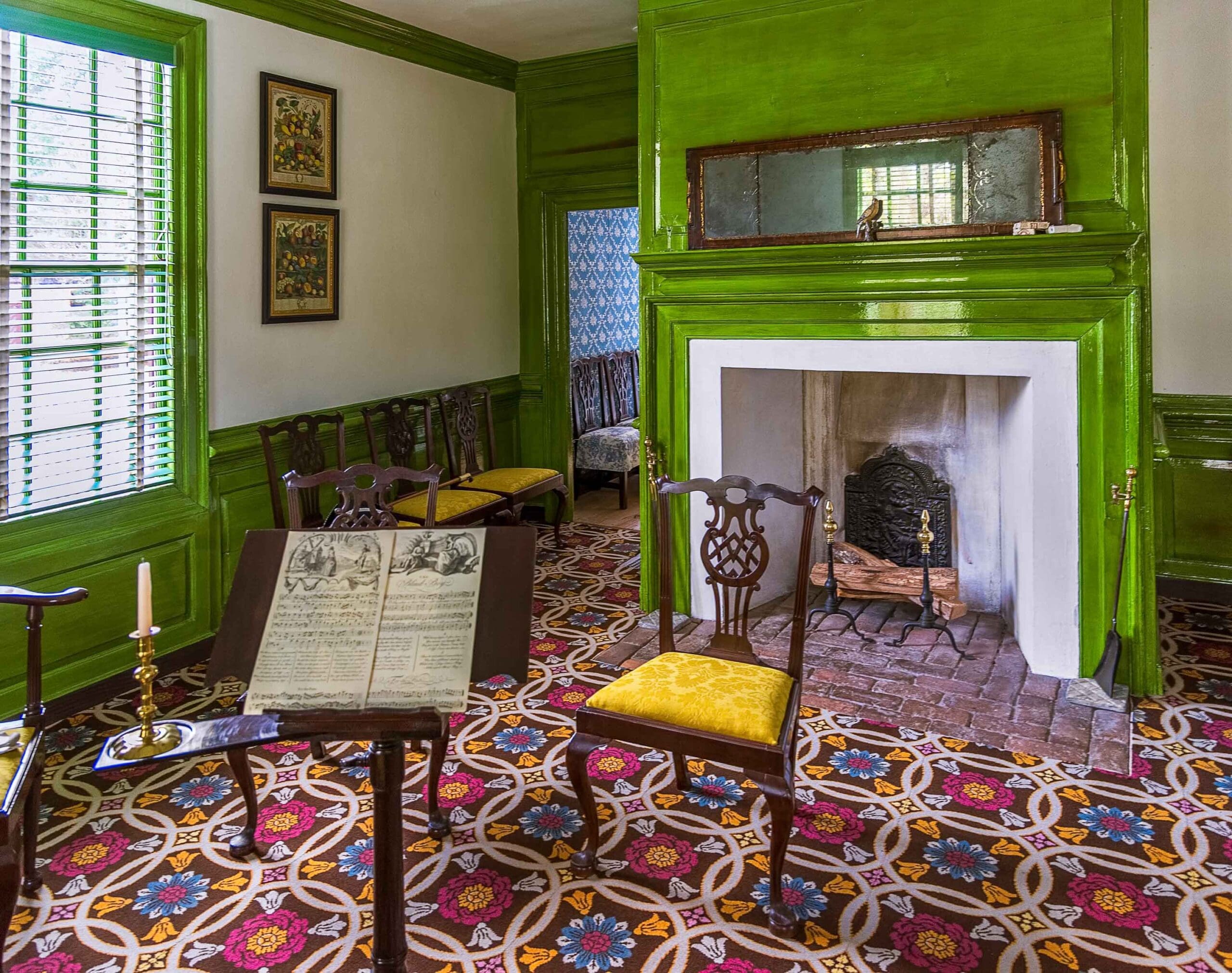
It has been open to the public for over 70 years, but the house is now being reimagined to portray the colors Everard would have chosen. In the parlor, he used a copper-based pigment called verdigris that creates a stunning and rich green.
“Verdigris was expensive; it showed off status, and Everard would have used it exclusively in public spaces seen by guests,” explains Keller, who notes that linseed oil, the paint medium of choice at the time, also added a semigloss glitz. But its copper base means it eventually fades to black, which explains why rich green turned greenish-black until newer technology revealed its true color.
“The study of historic color is constantly changing. We’re now seeing the results of generations of scholarship and technological advancements, as well as access to primary source documents like probate inventories and household orders,” says Moffitt. This research also includes context clues. Knowing Everard had a bright blue in the bed chamber and a sunny yellow in the dining room meant that the parlor had to be either red or green—both high status colors of the time.
But the study of historic color is fluid, and just like muted colors evolved into vibrant hues, there are still discoveries to be made. “In 30 years, another curator could reanalyze and find something different when it comes to color. Nothing is set in stone,” adds Keller.
Developing the Williamsburg® Color Collection
“We took all of the colors found through analysis of period buildings, paints made from pigments advertised in 18th-century Williamsburg, and period recipes and brought the color samples to the table,” explains Matthew Webster, executive director of the Grainger Department of Architectural Preservation and Research. Cornwallis Red, Damask Gold, Parrot Green, Gaddy Verdigris, and Palace Blue are standout brights.


A sample of paint magnified for examination under a high-powered fluorescence microscope. This sample is from the Thomas Everard House parlor chair rail. Photos by Kristin Moffitt
This article originally appeared in the August 2024 issue.


